Website optimization
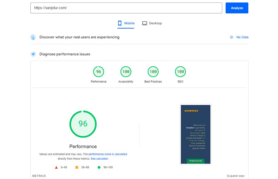
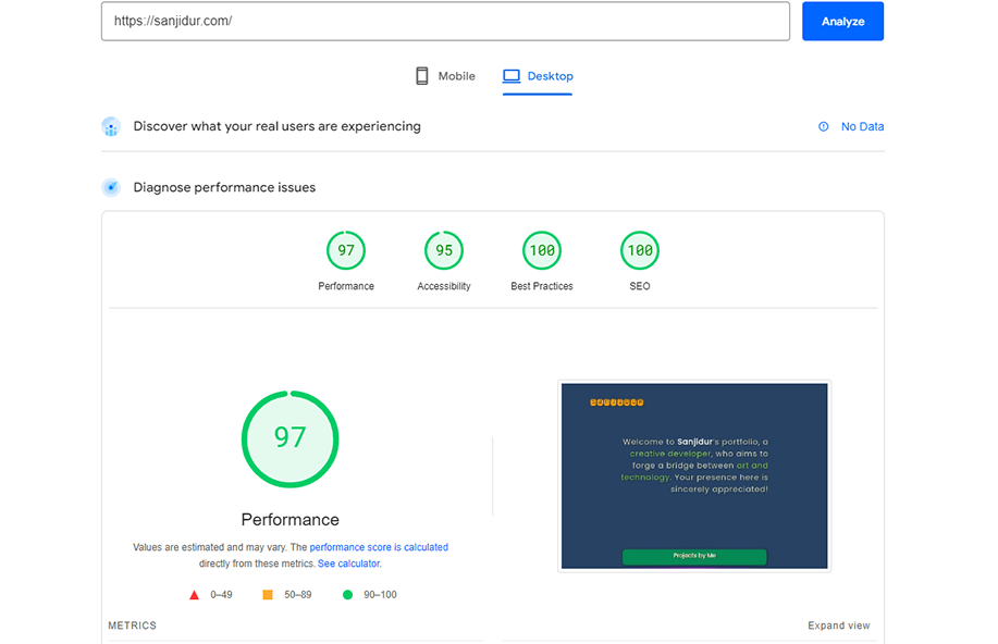
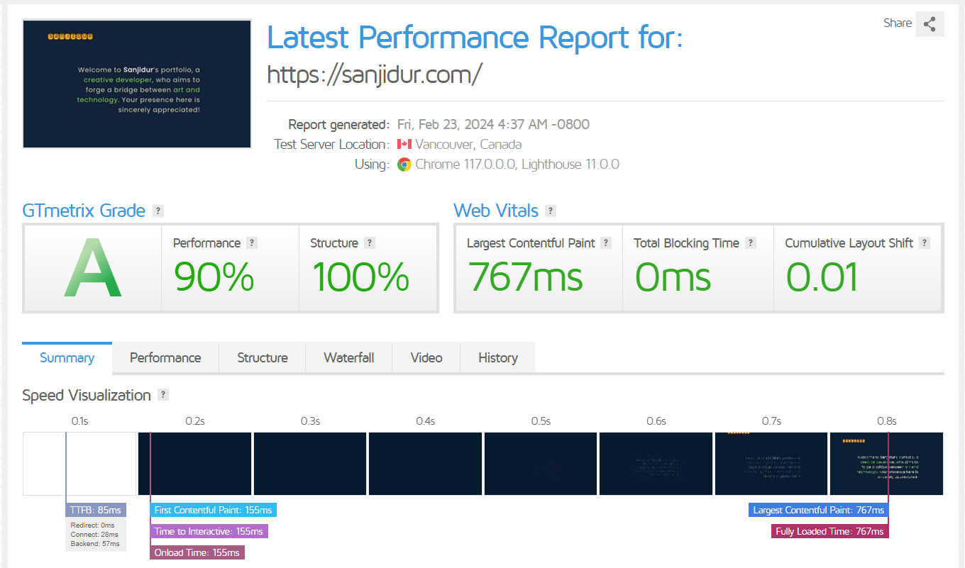
This web site was made with vanilla JavaScript, HTML, and CSS. Only few Bootstrap features like modal, carousel for images and few simple buttons were used. Most of the page structure used Flexbox from CSS. For responsive page layout, JavaScript were used for the changes of interactivity. User experience was one of the main focuses while not compromising the aesthetics. Finally, most of the pages were optimized for different device screen sizes and connectivity.
To optimize the page, it was tested that using the least number of (one or two) 3rd party libraries resulted the best performance. Because, when server gets a page request from user, it will not only send the page, but also the whole 3rd party libraries in the response. So it activates a chains of responses and makes the load time way more than optimally needed. This can be solved by caching those library, but the first impression won’t be satisfactory for the users as well as algorithm used by search engines may skip these pages.
So most of the assets, including fonts and images are hosted from one main server and then cached from DNS provider. That way server will send only one or few responses to user saving tremendous loading time. Another method can be used for assets like images and fonts, which stays underneath of folded pages on load, are lazy loading and preload. With this method the top resourced of pages contents from page will be loaded first and the other contents will be loaded in behind. And the result will be substantially satisfactory.
Check the results yourself!


